June 2nd, 2010, 11:08PM by nat | 12 comments
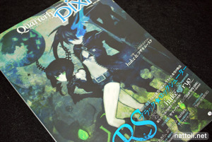
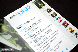
The first volume of Pixiv Quarterly was released May 28th, marking yet another way to consume the media generated by thousands of artists on the online art community. The premiere issue features a lengthy discussion on Black Rock Shooter, as well as how-to art and interviews with well-known artists.
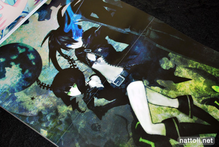
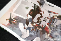
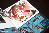
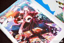
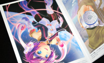
The Black Rock Shooter cover art work by Huke is also featured inside as a fold-out poster, with the opposite side featuring new art work by Kozaki Yusuke.
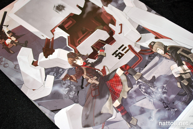
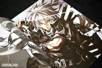
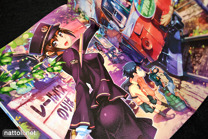
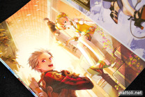
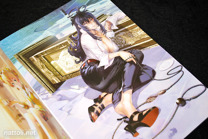
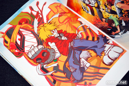
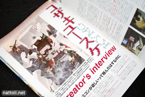
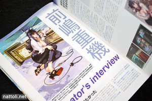
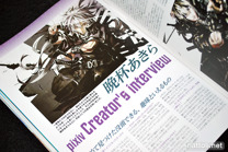
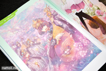
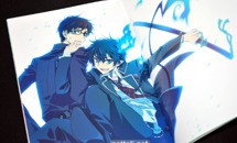
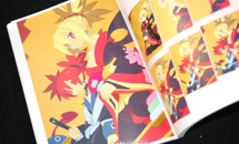
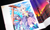
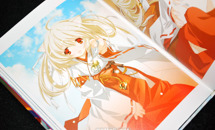
Kozaki Yusuke's work is repeated inside as a two page spread, but as this magazine is very sturdy and glue-bound, the illustration does get cut off in the center, so it's a good thing there's a poster. Unfortunately, the other showcased talents at the front don't have the same luxury. Banpai Akira (晩杯あきら), Putidevil, Vania 600, Nardack, and Shigeki Maeshima all have full page, or two-page spread illustrations at the front of the magazine.
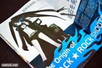
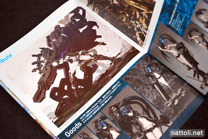
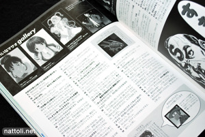
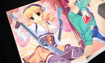
The feature on Black Rock Shooter is 14-pages long and includes an interview with Huke and Ryo from Supercell, along with BRS tribute art works by other artists, most of which you've probably seen if you're at all familiar with Pixiv. Also included are photos of the goods spawned from the franchise, like the Goodsmile figures, the BRS Nendroid slated for July and the Figma also due out in July. There's also an "anime" Black Rock Shooter figure pictured that's due out in October. The tribute arts are printed small, but some of the artists featured are Sino, Toshimasa Komiya, Saitom and CHAN X CO.
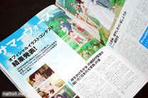
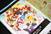
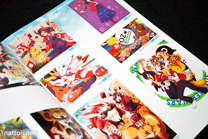
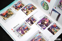
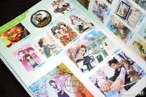
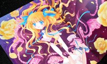
Twenty pages of the magazine are dedicated to the entries and winners of the Summer Wars Official Illustration Contest. The winners and entrants aren't the same level of professional as the featured artists in this issue, but the illustrations are really impressive. Again in this section, aside from the winners, the majority of illustrations are printed in small thumbnail sizes with the user's Pixiv ID next to it, so you can have a better look if need be.
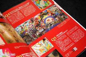
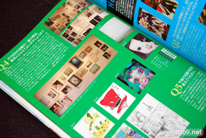
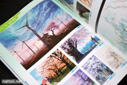
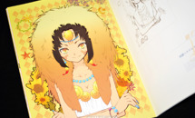
The next sections features "Out of Pixiv" artists, basically artists who work in real media and don't produce their art work entirely on the computer. But technically they are on Pixiv, as they photograph their work and upload it to the site.
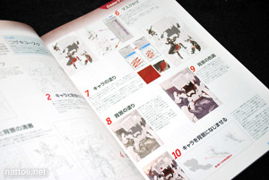
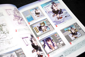
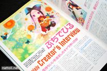
The artists with featured illustrations in the front of the magazine are revisited throughout the issue with interviews and small how-to art sections that show the illustration process for each featured work, except for Nardack's work.
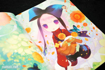
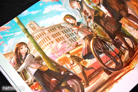
The last significant portion of Quarterly Pixiv Vol. 01 is dedicated to illustrations featuring flower blossoms, school girls and a spring theme. Most of the art works on these 24 pages are again thumbnail sized, but Pixiv IDs are clearly published next to each illustration, so if you want to see more (or a bigger picture) from the artist, you only have to visit the website.
It's a decent start, though I would have liked to see more magazine exclusive art work from artists who weren't necessarily already well known. Though many amateur artists were featured, their works were given a small presentation, kind of like a fan art section at the end of a Newtype Magazine. Since it is quarterly though, it's not a big commitment money-wise, so I'll probably check it again later to see if it gets better ^^
- Title: Quarterly Pixiv Vol. 01
- タイトル: Quarterly Pixiv Vol. 01
- Pages: 128
- Release date: 05/28/2010
- Buy: Amazon Japan





 Saving…
14 years, 10 months ago
thats actually nice, I keep thinking that I should 'subscribe' to style school (since dark horse stopped publishing it)
14 years, 10 months ago
by the way, whats the pixiv id of http://www.nattoli.net/art/4467 ?
14 years, 10 months ago
http://www.pixiv.net/member_illust.php?mode=medium&illust_id=10859558
14 years, 10 months ago
thanks =)
14 years, 10 months ago
I know I didn't request it but thank you, it helped me out too!
14 years, 10 months ago
Thanks :3
14 years, 10 months ago
I thought there were more pages about Tete and it showed animation process :( However it's still a nice book.
14 years, 10 months ago
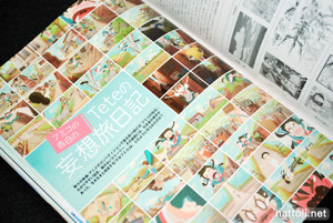
There are 6-pages on Tete, one in color and the rest are black and white. It's mostly an interview, with sketches around it. As for the animation process, what's shown is a map terrain of the where the story takes place and how she gets from point A to B. It's more story board-like than animation process.
14 years, 10 months ago
It looks better than Comickers and SS to me, doesn't it?
14 years, 10 months ago
Yeah, they're all competing in the same kind of market, but I do think Pixiv has the edge on this one because of the more marketable art style they pursue. But SS has Range Murata, so I still love it :3 Haven't bought a Comickers issue in forever...
14 years, 10 months ago
A must have for me! Thanks for the review :3
14 years, 10 months ago
BTW 1200 Y from cdjapan and all together with shipping its bout 17 Euro for my country. DING in basket already! :3